Back to Posts
2021년 1월 24일
피츠의 법칙과 Touch Target
[UX/UI의 10가지 심리학 법칙] 책을 읽으며 법칙별로 내용 요약 + 개인적으로 찾았던 레퍼런스 + 그밖에 자료들을 모아서 작성한 글입니다.
사용하기 위해 움직이는(소비하는) 시간을 줄인다. → 접근성
- 인터렉션은 최소한의 노력만으로 불편없이 간단하게 이뤄져야 한다.
- 사용자가 인터랙티브 요소를 사용하려고 움직이는 데 드는 시간은, 인터렉션의 중요한 지표다.
- 디자이너는 인터랙티브 요소의 크기와 위치를 적절하게 지정함으로써,
- 사용자가 해당 요소를 손쉽게 선택하게 하고,
- 선택 가능 영역에 관한 사용자의 기대에 부응시켜야 한다.
- 마우스나 손처럼 정밀도가 제각기 다른 다양한 입력 방식이 존재하는 오늘날의 사용환경을 고려하면, 꽤 어려운 과제다.
피츠의 법칙
- 대상이 커지면, → 대상 선택에 드는 시간이 줄어든다. (W)
- 대상 선택을 위해 움직이는 거리가 줄면, → 대상을 선택하는 데 드는 시간도 줄어든다. (D)
기원
-
1954년 미국의 심리학자 : 폴 피츠
-
터치 대상까지 움직이는 데 드는 시간을 대상까지 거리와 대상 너비 간의 비율에 관한 함수를 통해 예측하면서 탄생
-
피츠의 법칙은 오늘날 인체 움직임에 관한 가장 영향력 있는 수학적 모델로 여겨지며,
- 인체 공학, 인간-컴퓨터 상호작용 분야에서
- 실제로든 가상으로든,
- 대상을 가리키는 행동에 관한 모델을 만드는 데 널리 쓰이다.
-
피츠는 대상 선택 작업의 난이도 ID를 정량화하는 측정 기준도 제시했다.
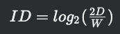 - D : 대상 중심까지의
거리 → 신호 signal - W : 대상의 허용 오차 혹은 너비 → 잡음 noise
- D : 대상 중심까지의
거리 → 신호 signal - W : 대상의 허용 오차 혹은 너비 → 잡음 noise

피츠의 법칙과 Accessibility
- 피츠의 법칙에서는 2가지 개념이 나온다. 대상 선택을 위해 움직인 거리와 대상 선택이 용이하게끔 키우는 것.
- 인터렉션의 향상을 위해 → 잡읍을 없애고 거리를 줄이는 것이 핵심이다.
- 3가지 개념이 나오는데, 대상과 타겟, 거리이다.
- 대상은
- 모바일 : 내 손가락
- 웹 : 마우스 포인터, 및 기타 기기
- 타겟은 UI 엘리먼트
- 대상과 타겟과의 거리에 영향을 주는 것은 여러가지가 있겠지만 여기서는 2가지를 얘기한다.
- 대상이 어떤 목적을 위해 움직일때의 맥락(상황)
- 기기
- 결국에는 상황에 맞춘 레이아웃을 잡는 것인데, 이는 디자이너의 영역으로 생각하자.
- 대상은
- 여기서 프론트 개발자가 제어할 수 있는 부분은 UI 엘리먼트이다.
- 웹 콘텐츠 접근성 가이드(WCAG 2.0) 에서도 타겟 사이즈에 대한 내용이 나온다.
- 이처럼 피츠의 법칙은 접근성과 관련이 있으며, 이중에서도 터치 타겟과 관련이 있다.
- 영향력있는 단체에서 잡은 터치 사이즈 권장 규격을 확인하고,(머테리얼 디자인 기준)
- 터치 대상의 크기
- 요소 사이의 간격
- 적용한 사례를 살펴보자.
Touch Target
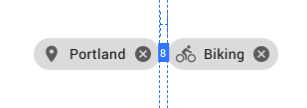
터치 타겟의 개념에 3가지가 나오는데, 크기, 다른 요소간의 간격, 유사한 흐름에 배치
- 터치 대상의 크기는 사용자가 정확하게 선택할 수 있을 정도로 충분히 커야 한다.
- 터치 대상 사이에 충분한 거리를 확보해야 한다.
- 터치 대상은 인터페이스상에서 쉽게 도달할 수 있는 영역에 배치해야 한다.
터치 대상의 최소 권장 규격
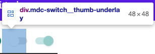
- Human interface guideLine : 44 * 44 pt
- Material design guideLine : 48 * 48 dp
- Web contents Access GuideLine(WCAG) : 44 * 44 CSS px
- 닐슨 노먼 그룹 : 1 * 1cm
디자인 시스템에 적용하긔
- 프론트에서는 프로젝트에 디자인 가이드라인이나 basic philosophy부분에 디자이너와 협의하여 최소 권장규격을 지정하고, (혹은 위에서 제안하는 권장규격을 따르거나) 개발자는 input 성격을 갖고 있는 컴포넌트 소스에 기본 값으로 해당 값을 지정하는 코드를 넣어두면 될 듯 하다.
- 아래에 머테리얼 디자인에서 구현한 방식을 따르는 것도 좋은 방법인듯하다.
- 최근에는 구글 머테리얼 디자인의 desgin foundation을 따르는 곳이 많아진 듯 하다. (글쓴이 피셜)
대상이 다를 경우
- 웹의 경우 데스크탑웹과 모바일 웹이 존재하는데, 각각 사용대상이 다르다.
- 데스크탑의 경우 마우스 포인터를 사용, 모바일 웹에서는 손가락 터치를 사용한다.
- 만약 이를 구분하여 적용해야할 여백등이 고려되어야할 경우 미디어 쿼리의 pointer를 활용하면 된다.
.container a {
  padding: 0.2em;
}

@media (pointer: coarse) {
  .container a {
    padding: 0.8em;
  }
}
Material design - Touch Target
- 구글 머테리얼 디자인에서는 최소 규격을 48dp로 지정하였다. 웹에서도 터치 최소 규격이 48px로 계산된다.
- 구글 머테리얼 디자인에서
@material/touch-target라는 패키지를 제공하는데, 추가적인 sass파일을 적용시켜준다.
기본 버튼
<button class="mdc-button">
  <div class="mdc-button__ripple"></div>
  <span class="mdc-button__label">My Inaccessible Button</span>
</button>
touch-target로 감싸기
- mdc-touch-target-wrapper로 감싸고
- mdc-button__touch를 추가해두었다. → 여기에 absolute로 height값이 지정된다.
<div class="mdc-touch-target-wrapper">
  <button class="mdc-button mdc-button--touch">
    <div class="mdc-button__ripple"></div>
    <span class="mdc-button__label">My Accessible Button</span>
    <div class="mdc-button__touch"></div>
  </button>
</div>- touch-target의 scss 파일을 보면, height값과 width값에 default값으로 48px을 적용한 부분이 보인다.
- 마지막 margin부분은, 강제로 적용한 touch target 영역을 채우기 위해 margin을 추가적으로 적용하는
부분이 보인다.
아름답다.. 지금까지 scss를 잘 활용하지 못했다고 생각했다..
// node_modules/@material/touch-target/_touch-target.scss

@use '@material/base/mixins' as base-mixins;
@use '@material/feature-targeting/feature-targeting';

$height: 48px !default; 👈👈👈
$width: $height !default;

/// Styles applied to the component's touch target wrapper element.
@mixin wrapper($query: feature-targeting.all()) {
  $feat-structure: feature-targeting.create-target($query, structure);

  .mdc-touch-target-wrapper {
    @include feature-targeting.targets($feat-structure) {
      @include base-mixins.emit-once('mdc-touch-target/wrapper') {
        display: inline;
      }
    }
  }
}

@mixin touch-target($set-width: false, $query: feature-targeting.all()) {
  $feat-structure: feature-targeting.create-target($query, structure);

  @include feature-targeting.targets($feat-structure) {
    position: absolute;
    top: 50%;
    right: 0;
    height: $height;
  }

  @if $set-width {
    @include feature-targeting.targets($feat-structure) {
      /* @noflip */
      left: 50%;
      width: $width;
      transform: translate(-50%, -50%);
    }
  } @else {
    @include feature-targeting.targets($feat-structure) {
      left: 0;
      transform: translateY(-50%);
    }
  }
}

@mixin margin(
  $component-height,
  $component-width: null,
  $touch-target-height: $height,
  $touch-target-width: $width,
  $query: feature-targeting.all()
) {
  $feat-structure: feature-targeting.create-target($query, structure);

  $vertical-margin-value: ($touch-target-height - $component-height) / 2;

  @include feature-targeting.targets($feat-structure) {
    margin-top: $vertical-margin-value;
    margin-bottom: $vertical-margin-value;
  }

  @if $component-width {
    $horizontal-margin-value: ($touch-target-width - $component-width) / 2;

    @include feature-targeting.targets($feat-structure) {
      margin-right: $horizontal-margin-value;
      margin-left: $horizontal-margin-value;
    }
  }
}
Material design - Space methods
- 구글 머테리얼 디자인에서는 UI 요소사이의 공간을 8dp 혹은 4dp 단위로 측정한다.
- 웹에서도 8px, 4px 단위로 여백을 조정한다.
- 보통은 8px로 진행하는 듯 하다. 이 글 과 연관이 있지 않을까 싶다.
Layout
- 사용자의 맥락을 고려한 레이아웃은 디자이너의 영역에 가깝지만, 사용자의 기기와 관련된 나용은 한번은 읽어볼만한 내용이였다.
스마트폰 form factor가 다양하다.
- 어떤 작업을 할지, 양손을 다 쓸수 있는지에 따라 → 스마트폰을 손에 쥐는 방식도 달라진다.
- 한손밖에 쓰지 못할 때 : 기기를 쥔 손의 엄지손가락으로 터치하는 경우, 잘 닿지 않는 영역이 생긴다.
- 한 손을 쓸 때의 정확도는 오른쪽 하단에서 왼쪽 상단까지 선형으로 증가하지 않는다.
- 스티븐 후버가 진행한 연구
- 사람들이 시선을 두거나, 터치하기 선호하는 영역은 → 스마트폰 화면의 중앙부. 정확도도 중앙부가 높다.
- 집중하고 싶어하는 영역 : 중앙부
- PC와는 다르다. PC는 왼쪽 상단에서 오른쪽 하단으로 훑어봄
- 양손을 쓸 수 있어서 한손으로 기기를 쥐고 다른 손으로 터치하는 경우 동일한 영역도 쉽게 선택할 수 있다.
위 내용은 uxmatters의 글을 읽어보는 것이 더 재밌다. 해당 포스팅에서는 자세히 다루진 않겠다.
- Design for Fingers, Touch, and People, Part 1
- Design for Fingers, Touch, and People, Part 2
- Design for Fingers, Touch, and People, Part 3
적용한 컴포넌트 사례
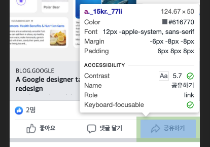
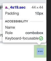
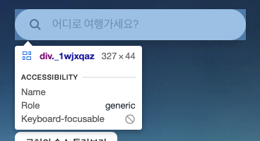
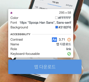
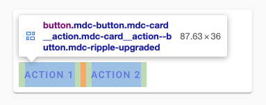
- 요즘은 개발자도구에도 접근성이 아주 잘나온다..!
- 토스는 전체적으로 시원시원한 UI를 갖고있다는 느낌이 들곤했는데, 아무래도 이런 Touch Target의 최소규격을 사용성이 좋게 적당히 잡아둔 듯 하다.
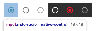
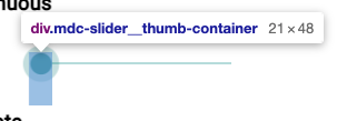
Touch Target
- (Material design) Radio
- (Material design) Slider
- (Material design) Switch
- (Facebook) Button
- (Facebook) Button - icon
- (Airbnb) Input
- (토스) Button - fullfilled
Space
- (Material design) Dialog
- (Material design) Chips
참고자료
- Accessible tap targets
- 미디어 쿼리 초보자 안내서
- Material - Layout and typography
- Material - web - touch target
- Material - Spaceing methods
- Material Web Components Catalog
- Google - 접근성을 고려한 개발
- Google Web Fundamentals - Accessibility
- toss
- Design for Fingers, Touch, and People, Part 1
- Design for Fingers, Touch, and People, Part 2
- Design for Fingers, Touch, and People, Part 3
- [피츠의 법칙] Fitts’ Law & Paul M. Fitts
Related
2025년 1월 19일
2021년 1월 10일